osp blog

Articles in the type category

  • Freie Schriften im Portrait

    By Femke

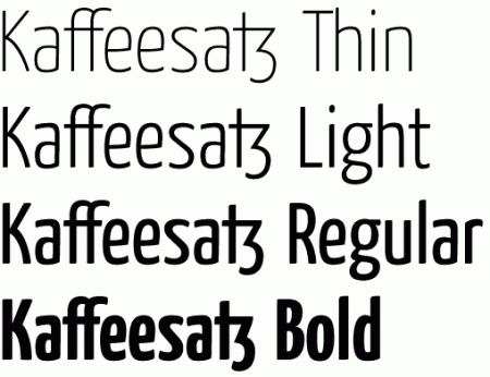
    For those who read German, type designer and -critic Gerrit van Aaken published quite a few well-researched essays on familiar open source typefaces such as Gentium and Vera plus a few surprises such as Kaffeesatz and Union (not under an open licence, but distributed by the Danish government for use …

  • Two Times Collaborative Type

    By Femke

    Two projects to submit fonts to, or find others to work with:

    Typeforge
    http://www.typeforge.net
    fontforge

    The Typeforge project was initiated by Portuguese type designer Pedro Amado, to create a platform for "open source collaborative type design". You are encouraged to share sketches, notes and ideas and work on …

  • This font is a ripoff, said the Invalidity Division

    Invalidity Division, sounds like science-fiction, doesn't it? Registered community design is not bad either. Time to start a jargon file...

    [...]this time the dispute is over fonts; specifically Segoe, one of the typefaces Microsoft wants to use in Vista (the new Windows, "bringing clarity to your world"). Microsoft filed its …

  • The Open Font License

    By Femke

    [check The politics of typography before applying SIL-OFL]


    The SIL-OFL is a free license specifically developed for (multi-lingual) fonts. These are the four freedoms guaranteed through the Open Font License (similar to other Free licenses):
    * Use: the freedom to use font software for any purpose. (freedom 0)
    * Study and adaptation …

  • Alpha font

    alphabetum.png

    Most amazing font so far, the Alphabetum font, for ancient languages. It is now possible to compose text with languages that disappeared 5000 years ago. I have to say all my respect for such a nice and usefull work! Thanks from university researchers that had to redraw all archeologic inscriptions …

  • Linux Libertine font project

    libertine
pic

    The Libertine family font contains around 1500 "western" caracters among which cyrillic, greek, turkish and so on. The font looks classical, between Baskerville and Caslon style. The general impression is a contemporary looking 19th century font. Hints are good looking above 8 points, and is comfortable on screen. Good typography …

  • Gentium

    By Femke

    [If you consider using Gentium, check The politics of typography]

    gentium
font

    "Gentium was driven by the need for a free, attractive, legible, high-quality font for extended Latin (and Greek and Cyrillic) use. Nothing else was available that was suitable for publishing use, so I decided to give it a try." (from …

« Page 3 / 3