Lecture at Freestyle - FLOSS In Design, Piet Zwart Institute Rotterdam

During my 6 year freelance graphic design practice and 4 years study I gradually became aware of working methods in the general sense. In every aspect of my practice working structures developed, some are critically looked at, some are educated and some seemed to be accepted as they seemed to be litrally connected with my work. One of these structures I immediately accepted, is software because of their seemingly neutral qualities used for each design-solution. But did during these 10 years my work become more dependent on the possilities as presented through the programms?
I was asked by Matthew Fuller to design the leaflet for this seminar
using only open source software. As I didn't have any experience with
open source software and I needed to use a Linux computer on the Piet
Zwart Institute I made before I started two descisions:
- the maximum amount of time I could spent on the design was 24 hours
- I'd keep two diaries, a formal and an emotional one. The formal one
was the recording of events and the emotional one the recording of my
thoughts (as a frustration/happiness index).
The following text is the offspin of these two diaries.
24H OF OPEN SOURCE
actors:
Roger Teeuwen, graphic designer; first experience with open source
software
Matthew Fuller, course director Piet Zwart Institute
Femke Snelting, curriculum an research development Piet Zwart Institute
Calum Selkrik (Cal), systems administrator Piet Zwart Institute
Michael Murtaugh, mentor Piet Zwart Institute
Todd Matsumoto, student Piet Zwart Institute
31 march 2004
11.00
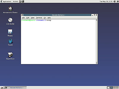
Calum set me up, made an user account on a linux computer.
I'm started with three open source programms:
The Gimp (alternative Adobe Photoshop),
Scribus (alternative QuarkXpress) and
Sodipodi (alternative Adobe Illustrator)
12.45
Talked with Femke about the difference between open source and
proprietary (copyright+), that new functions and opening the program
language are the most potential area's. For example dreamweaver (which
is not open source); connection of visual and code, in this programm the
possibility exists to use ór a visual-based way ór a code-based of
developing a site. As a user you can switch between the two.
13.11
So language and definition are essential in programme development. But
why base the program you are developing on existing software rather than
think about ways to redefine workspace or software alltogether? If the
code is visible during the time you are using software the possibility
to change and experiment appears. The connection between language, code
and form becomes more explicit and therefor the user is more aware of
the possibilities ánd more aware of the way his or her actions are
defined through software.
13.15
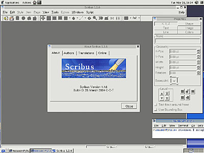
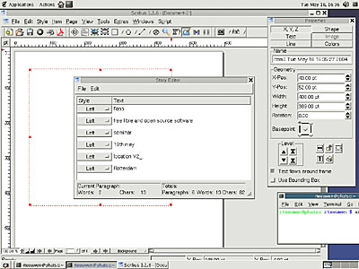
Scribus is really inlogical when you are used to work with xpress.
There is a disconnection between textinput and the textfield, but only
when creating a textfield, after doing this it's defined and you can
change and activate the field.
A pdf writer seems to be incorperated, so publishing should be possible.
This is one of my biggest concerns as a graphic designer!
13.24
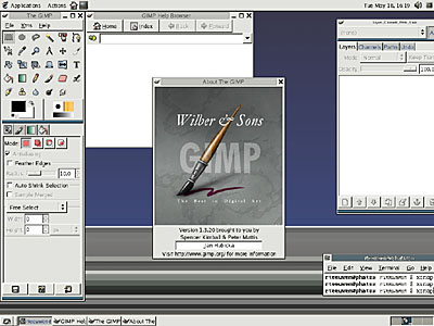
Found a mail when doing some research which seems to be the start of
the development of 'The Gimp'.
Date: july 29th 1995
Suppose someone decided to write a graphical image manipulation program
(akin to photoshop). Out of curiousity (and maybe something else), I
have 2 questions:
What kind of features should it have? (tools, selections, filters,
etc.)
What file formats should it support? (jpeg, gif, tiff, etc.)
13.42
In the Gimp there is an option to write scripts and to incorperate them
in the programme!
Computer litracy demands a new way of reading, the language is sometimes
so specific and needs so much knowledge it's hard to find an answer for
the question you formulated!
13.53
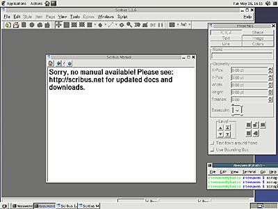
Need the the open source user manual for Scribus! The user manual isn't
functioning!
13.58
During some kerning actions in Scribus the programm crashed! Of course
I didn't save my document!
14.03
Selecting a text in Scribus really takes a while, and it feels
unstable!
15.35
Imported my first picture in Scribus, also feels unstable!
15.38
Switching to Sodipodi, really looks like a stripped version of Adobe
Illustrator: the functions and interface resemble. Why are visual
elements not included when developing open source software? Every
programme looks like a old copy of Microsoft Word.

15.49
I'm actually considering to use paper again to write idea's down!
This work-enviroment feels so new and so inefficient!
15.59
What is software? A collection of definitions and functions which
control your behaviour and actions? Or a way of structuring and
capturing ideas?
What should software be?
16.11
Switching to The Gimp.
16.30
Made my first collage, an open source collected image.

16.45
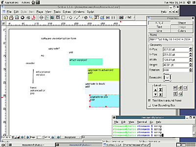
Thinking about the way software is presented when purchasing. Could
there be some sort of a scedule or map which explains why open source is
a legible option? As a visualisation of the pro's and con's of open
source.
16.58
Needed Cal's help to print a document from Scribus.
Printed at 17.21, turned out you need to make a pdf from the document
and than run GGV PostScript Viewer and print from this application.
So much trouble to print a document. Intresting though that Cal thought
the document (which was only a test) had a meaning and was a design! If
you need to put a lot of effort in making a print you seem to need a
reward!

17.31
The Gimp crashed. Lost an schematic on how open source could be
visualised! The programme name has (unstable) behind it, this is
correct!
17.45
Partially remade the lost image, this is a way of learning a program!
(not an appealing one though)
17.45
Back to Sodipodi and Scribus to remake the Gimp pattern as a test. It
seems patterns and structures aren't as easy to create as in Adobe
Illustrator or even Quarkxpress! A lot of features which I use a lot are
ór really hidden ór not present.
17.54
Sodipodi crashed when attempting to step and repeat.
So easy and so complicated!
18.06
I start to feel a connection with The Gimp, maybe because I get tired
or maybe because it's the only application so far in which I'm succesful
in my attempt to create a image...
I do get constantly confronted with the different way of functionality.
Got the feeling I could even be more efficient in Texteditor (Macintosh)
than in all open source software combined! At least in terms of speed
and meaning!
Definitions of my existing work-enviroment:
Proposal for a action based work-enviroment:
Q: what do you want to do during this session?
are you going to use text?
what kind of typographic elements do you need?
are you going to use images?
are you going to use forms?
pixel?
vector?
what would you like for a color today?
what kind of sound would you like to hear?
do you need a source of information?
if yes
what kind of subject are you interested in?
repeat answer if you have multiple intrests
Typographic:
what kind of typefaces do you need?
do you want to choose from a database?
if yes: schreef or schreefloos, postscript or truetype
what kind of sizes are you going to use?
14 april 2004
12.18
Cal helped me getting started.
12.19
Decided I'd focus on Scribus to design the leaflet because it's closed
source rival Quarkxpress is the programme I use the most often.
12.38
Can't find scribus, need Cal.
13.06
Using terminal to start scribus (instructions cal).

13.45
Talked with Matthew about the time schedule, he suggested I'd finish
the design today. I'll start with the information side first and
concentrate on the typography!
13.54
Installed bitstream vera, one of the only open source typefaces I could
find.
14.12
Can't seem to find a&u in scribus, seems no typographic subtilities are
possible. Why the same typographic lack of possibilities as in Microsoft
Word? Unbelievable that the 'alternative programme' isn't precise in the
key element of a dtp programme, typographic refinement!
14.15
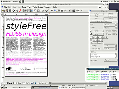
Interesting, I can make buttons in scribus which allow me to import or
use other actions when activating. Could be a very interesting
automatisation for correcting large amounts of texts! This is an example
of a functionality which I hope(d) to find more often when using
'alternative' software.
14.45
Trying to link two textboxes. I figured out the difference between
active and passive text boxes but the actual linking doesn't work
(annotation properties)!
14.55
I actually think a programme like Scribus is much closer to a writer
(programmer, etc.) than a designer, much more litrally a text-editor. It
looks it's more the other way around, thinking through content about the
format.

15.03
Because of the last statement I suddenly feel I understand the software
more, and I'm more and more looking for functions which I use a lot in
Xpress in Scribus and I'm much more succesful is my quest!
15.16
Are there connections or explanations possible which emphasise the
'cross-influence' between the different programms, so open and closed
source combined? As a translation of the best of both worlds, the user
specific elements of the closed source ánd the idea's and possibilities
of open source.
16.13
Matthew suggests I should also think about the programmer/user relation
(reacting on programme/programme and profession/crossover relations).
16.48
Trying to print the document, no luck, need Cal.
Also found out that when exporting to pdf there is a fontproblem.
Why is there always a problem with printing? Doesn't give me confidence
for the final printing of the leaflet!
17.07
Pdf works, printing is possible.
But it's impossible to print a different paper size than A4!
17.10
Talked with Cal about open en closed source
programmedefinition-combinations, using his specific knowledge and using
freshmeat.net

18.15
Talked with Femke about the combinations and concluded combinations
between writer, programmer, artist, designer should be more
self-explanitory.
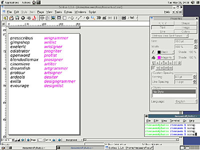
In the evening I tried to make combinations with 4 definitions. I ended with 12 programme-combinations and 12 definition-combinations.
15 april 2004
9.29
Starting up.
9.42
Continued working on definition-combinations.
I've got two sets of definitions, programms and users.
How can I combine these and make sure it's readable ánd on the other
hand stress the difference in meaning?
9.46
I've got two sets of 12 combinations, the trick is now how to make the
difference between programms and user-definitions visible.
10.10
Talked with Todd about the concept of the flyer and tested if the
combinations were readable, and they were! The programms were much
easier than the users but I think they should function as the bridge
between the two.

11.11
Finished with both sides, need a print now.
11.15
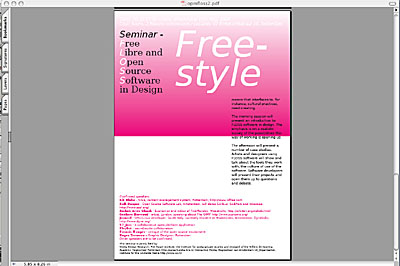
When I export the document to pdf or postscript file the linked
textboxes dissapear and gradients turn upside down! This is a reason not
to use Scribus, really bad for you're confidence when making a 300 pages
book if you know texts can dissapear and things can change!
11.17
Cal suggested that I should save the file as a postscript document and
than use the viewer to check and print.
11.35
Cal updated Scribus in an attempt to solve the problem, have to wait a
few minutes until its compiled and I can test it.
12.05
Seems linked textboxes are the problem, so i'll make them by hand,
seperated!
Which is a strange job, compare it to use typograpy in photoshop. I
recognise this with second year students which I teach. The students
without experience also use the programme they know best to do
everything, even if the programme is not made for it.
12.13
Scribus isn't made for typograpy that's for sure, when I printed the
document you immediately see a sort of 'Microsoft Word' feel. This lack
of specific quality is problematic if it's aim is to be an alternative
for dtp programms which do have these qualities.

20 april 2004
11.30
Today is the last day of the open source leaflet project. A few things
remain to do, the corrections, the logo's and the final proof.
I'm actually getting more and more used to Scribus, or am I getting
sentimental?
11.55
Finished the corrections and scribus crashes!
11.56
Started again with the corrections.
12.35
Finished the corrections for the second time, but I can't finish the
leaflet today because of a missing logo.
21 april 2004
11.45
Final corrections and importing the last logo.

11.55
Printing problem, the logo's seem to change into black squares when
printing, they are visible on screen?!
Maybe the problem is in the image boxes?
Printing without image boxes.
No change
Maybe the problem is in the proportional scaling which I turned on?
Printing with proportional scaling turned off.
No change
Maybe the problem is in scaling in general?
Printing without scaled images.
No change
Maybe the problem is in textrunaround?
Printing with textrunaround turned off.
No change
Maybe the problem is in the file format?
Yes, there is a problem importing tiff, when using eps the problem is
solved! Another Scribus mistery!
12.35
Printing final flyer, doing some last minute detailing.
12.42
Mailing the pdf to richard (V2_) and now cross my fingers that the
printer can cope with the document!
22 april 2004
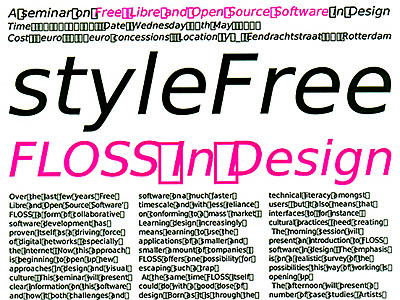
What I was afraid for becomes reality. When the printer test-prints the
document a lot of problems appear: spaces become squares, numbers,
points, comma's, dashes etc. dissapear!
Following a transcription of the e-mail contact between myself and
Jasper, responsible for prepress at the printer.

__________________________________________________________________
From: Roger Teeuwen
Sent: Thursday, April 22, 2004 14:47 PM
To: Jasper de Koster
Subject: Op verzoek van V2_
<>
Dag Jasper,
Hierbij opnieuw de pdf, hopelijk gaat het nu goed.
Als ik hier print gaat alles ok!
Groet en succes, Roger
april 22 14:47
Hi Jasper,
Attached again the pdf, hopefully it will work now!
When I print in my studio everything looks ok?!
Regards Roger
_________________________________________________________________
On 22-04-2004 15:25, "Jasper de Koster" wrote:>
Hoi Roger
Nee, dit gaat niet goed. Het blijven vierkantjes, alle spaties. Via
welk
programma heb je dit gedistilleerd?
Pagina 1 gaat wel goed, overigens. Kun je het omzetten naar
lettercontouren
in
illustrator?
groet, jasper
april 22 15:25
Hi Roger
No this doesn't work either. The spaces remain squares, áll spaces.
Which programm did you use to destilate this?
Page number one is ok.
Can you convert the document to Illustrator and use lettercontours?
Regards Jasper
__________________________________________________________________
From: Roger Teeuwen
Sent: Thursday, April 22, 2004 15:38 PM
To: Jasper de Koster
Subject: Re: Op verzoek van V2_
Wat ik trouwens niet begrijp is dat als ik bij mij op mijn laserprinter
print alles helemaal goed gaat?! Beschadigd het document tijdens
mailen?
Print jij gewoon of draai je direct een film uit?
Gr Roger
april 22 15:38
Hi Jasper,
What I don't understand is that when I print the document on my
laserprinter at 1200 dpi everything looks ok. Does the document get
damaged during mail? Do you print paper or directly to film?
Regards Roger
__________________________________________________________________
On 22-04-2004 16:19, "Jasper de Koster" wrote:
Hoi Roger
Misschien print jij niet via een laserprinter of belichter? Ik heb dit
probleem nog nooit eerder gehad. Zowel op film als op onze
laserbelichter
worden alle spaties vierkantjes. De asci code van het spatieteken in
Linux
is
kennelijk een vierkantje in postscript level 2.
Ik probeer photoshop wel als deze pdf niet lukt.
groet, jasper
april 22 16:19
Hi Roger,
Maybe you don't print using a laserprinter or a film-exposer?
I've never had this problem before. In both the laserprinter and the
film-exposer I get the same errors. The asci code for a space on a Linux
is appearently a square in postscript level 2.
I'll try photoshop if this pdf doesn't work.
Regards Jasper
__________________________________________________________________
From: Roger Teeuwen
Sent: Thursday, April 22, 2004 16:35 PM
To: Jasper de Koster
Subject: Re: Op verzoek van V2_
Hi Jasper,
Toch wel, hp laserwriter 5000 op 1200 dpi geeft geen probleem hier!?
Heel erg vreemd...
Hoe zit het met kwaliteitsverlies als je het photoshopbestand gebruikt?
Gr Roger
april 22 16:35
Hi Jasper,
I use an hp laserwriter 5000 on 1200 dpi and I don't get any problems
here?!
Really strange....
How is the qualityloss when using a photoshop rastering?
Regards Roger
__________________________________________________________________
On 22-04-2004 17:59, "Jasper de Koster" wrote:
Hi Roger
Ik ben er nu uit. Ik maak een combinatie van de beste elementen uit de
opties.
De logo's uit de eerstaangeleverde PDF, het kopje uit het Tiff bestand,
de
tekst uit een PDF bestand, dat ik heb gemaakt door het originele PDF
bestand
als PS te bewaren en opnieuw te distillen.
De fout ligt kennelijk in jouw distiller, want opnieuw gedistilleerd
verdwijnen de vierkantjes (maar helaas ook de datum en de cijfers).
gecompliceerd, dus
Onderstaand "monster van frankenstein" PDF komt bij mij netjes uit de
printer.
En ook (hoogstwaarschijnlijk) mooi op film.
groet, jasper
<
>april 22 17:59
Hi Roger,
I've got the solution. I'll make a combination between the best of both
options.
I'll use the logo's from the pdf, the head from the tiff, the text from
a pdf file which I made trough saving the original pdf file as an ps
file and than destilling it again.
I think the error is in you're destiller, because when I re-destille you're file the squares dissapear (unfortunately also the numers).
So pretty complicated.
The 'monster of Frankenstein'-pdf on the bottom does work on my printer and problably also on film.
Regards Jasper
trycombipdfandTiff.pdf

__________________________________________________________________
From: Roger Teeuwen
Sent: Thursday, April 22, 2004 18:21 PM
To: Jasper de Koster
Subject: Re: Op verzoek van V2_
Hi Jasper,
Ingewikkeld! En nog een probleem, in de magenta teksten op de tweede
pagina
onderaan (sprekers en colophon) valt een en ander weg (leestekens en
cijfers!). Vergelijk met tif.
Helpt het voor een betere kwaliteit als ik je een tiff op 600 dpi
stuur?
Dus nog niet ok!
Groet Roger
april 22 18:21
Hi Jasper,
Complicated! And another problem, in the magenta text on the second page
at the bottom (speakers and colophon) information is lost (numbers and
so on). Compare to the tiff.
Does it help for the quality if I send you a tiff on 600 dpi?
So still not ok!
Regards Roger
__________________________________________________________________
On 22-04-2004 18:35, "Jasper de Koster" wrote:
Hoi Roger
Oei, wat een klus
Ik denk dat het niet veel uitmaakt. Het blijven gerasterde letters op
die
manier.
Ik ga wel voor 70 lijns tiff die je eerder gestuurd hebt.
Of ik gebruik voor sprekers en colophon de tiff, net als bij de tekst
bovenaan.
Tenzij jij nog een ander soort PDF kunt aanleveren...
groet, jasper
april 22 18:35
Hi Roger,
My god what a project!
I don't think it will make a difference. The letters will stay
rasterised!
I'll use the 70 lines tiff you sent before.
Or I'll use the tiff for the colophon and speakers, just as the text on
the upper side.
Unless you can deliver me another pdf...
Regards Jasper

__________________________________________________________________
From: Roger Teeuwen
Sent: Thursday, April 22, 2004 19:08 PM
To: Jasper de Koster
Subject: Re: Op verzoek van V2_
Nee, een ander soort pdf gaat mij niet meer lukken.
Hoeveel minder van kwaliteit zijn gerasterde letters?
Volgens mij moet jij beslissen of je het bestand verder gaat plakken en
knippen, wat het beste resultaat is.
Laat even weten waar je uiteindelijk voor gaat.
Gr Roger
april 22 19:08
No, I can't deliver you another pdf.
How much does the quality decrease if the letters are rasterised?
I think you have to decide if you'll use the 'collage' file or the tiff,
which one the best result is.
Let me know which you will use.
Regards Roger
__________________________________________________________________
Van: Jasper@Tripiti.nl
Onderwerp: RE: Op verzoek van V2_
Datum: 23 april 2004 9:13:46 GMT+02:00
Aan: rtgo@xs4all.nl
Ik ga dan voor de Tiff versie, omdat ik geen vertrouwen heb in de PDF. Er kunnen cijfers en interpunctie zijn weggevallen of veranderd. Dit risico wil ik niet lopen.
Je kunt wel nog films controleren als je wilt, we drukken vanmiddag.
groet, jasper
april 23 9:13
Ok, I'll use the tiff, because I lost all my faith in the pdf. Numbers
or spaces can dissapear or are changed. I don't want to risk this.
You can come and check the films if you want to, we'll print this
afternoon.
Regards, Jasper
__________________________________________________________________
So in the end, despite the efforts of the printer, the open source programme 'Scribus' was unsuccesful in accomplishing one of it's main goals. Beïng an altenative for existing dtp-programms such as Quarkxpress or Indesign. As a designer I need to be sure that the document I create is printable, if it isn't I can't use it as a tool.
Through using open source software I did rethink the tools I use and the enviroment and work structures which are created by these tools. And I think this is an important issue which is crucial for all designers, artists etc. So I think one of the main goals of open source software development should be to make the programms formally usable, so designers, writers, artists will start using them.
On the frontside of the leaflet I stress the combinations of different positions. The different positions become more and more interrelated and I think the real gain in development will be in exploring these combinations. So let's start thinking about the way a designer, writer, artist and programmer can contribute together from each specific perspective and knowledge to the development of the software.