Interview with Harrisson
One of the co-conspirators in this open source adventure is a Brussels
graphiste going under the name Harrisson. His interest in open
source software flows with the culture of exchange that keeps the off
centre music scene alive, as well as with the humanist tradition
persistingly present in contemporary typography.
Harrissons' visual frame of reference is eclectic and vibrant, including
modernist giants, vernacular design, local typographic culture, classic
painting, drawing and graffiti. Too much food for one conversation.
_____________________________
You could say that "A typeface is entirely derivative", but others argue, that maybe the alphabet is, but not the interpretations of it.
The main point of typography and ownership today is that there is a blurred border between language and letters. So: now you can own the 'shape' of a letter. Traditionally, the way typographers made a living was by buying (more or less expensive) lead fonts, and with this tool they printed books and got paid for that. They got paid for the typesetting, not for the type. That was the work of the foundries. Today, thanks to the digital tools, you can easily switch between type design, type setting and graphic design.
What about the idea that fonts might be the most 'pirated' digital
object possible? Copying is much more difficult when you've got lead
type to handle!
Yes, digitalisation changed the rules. Just as mp3 changed the philosophy of music. But in typography, there is a strange confrontation between this flux of copied information, piracy and old rules of ownership from the past.
Do you think the culture of sharing fonts changed? Or: the culture of distributing them? If you look at most licenses for fonts, they are extremely restrictive. Even 99% of Free Fonts do not allow derivative works.

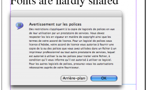
Warning message when attempting to embed a font in
InDesign
The public good culture is paradoxally not often there. Or at least the economical model of living with public good idea is not very developed. While I think typography, historically, is always seen as a way to share knowledge. Humanist stuff.
The art and craft of typeface design is currently headed for extinction due to the illegal proliferation of font software, piracy, and general disregard for proper licensing etiquette.
Emigré... Did they not live from the copyrights of fonts?!
You are right. They are like a commercial record company. Can you
imagine what would happen if you would open up the typographic trade -
to 'open source' this economy? Stop chasing piracy and allow users to
embed, study, copy, modify and redistribute typefaces?
Well we are not that far from this in fact. Every designer has at least 500 fonts on their computer, not licenced, but copied because it would be impossible to pay for!
Even the distribution model of fonts is very peer-to-peer as well. The reality might come close, but font licenses tell a different story.
I believe that we live in an era where anything that can be expressed as bits will be. I believe that bits exist to be copied. Therefore, I believe that any business-model that depends on your bits not being copied is just dumb, and that lawmakers who try to prop these up are like governments that sink fortunes into protecting people who insist on living on the sides of active volcanoes.
Cory Doctorow in http://craphound.com/bio.php
I am not saying all fonts should be open, but it is just that it would be interesting when type designers were testing and experimenting with other ways of developing and distributing type, with another economy.
Yes, but fonts have a much more reduced user community than music or bookpublishing, so old rules stay.
Is that it? I am surprised to see that almost all typographers and foundries take the 'piracy is a crime' side on this issue. While typographers are early and enthusiastic adapters of computer technology, they have not taken much from the collaborative culture that came with it.
This is the 'tradition' typography inherited. Typography was one of the first laboratories for fractioning work for efficiency. It was one of the first modern industries, and has developed a really deep culture where it is not easy to set doubts in. 500 years of tradition and only 20 years of computers.The complexity comes from the fact it is influenced by a multiple series of elements, from history and tradition to the latest technologies. But it is always related to an economic production system, so property and 'secrets-of-the-trade' have a big influence on it.
I think it is important to remember how the current culture of (not) sharing fonts is linked to its history. But books have been made for quite a while too.
Open source systems may be not so much influencing distribution, licenses and economic models in typography, but can set original questions to this problematic of digital type. Old tools and histories are not reliable anymore.
Yes. with networked software it is rather obvious that it is useful to
work together. I try to understand how this works with respect to making
a font. Would that work?
Collaborative type is extremely important now, I think. The globalisation of computer systems sets the language of typography in a new dimension. We use computers in Belgium and in China. Same hardware. But language is the problem! A French typographer might not be the best person to define a Vietnamese font. Collaborativity is necessary! Pierre Huyghebaerttold me he once designed an Arabic font when he was in Lebanon. For him, the font was legible, but nobody there was able to read it.
But how would you collaborate than? I mean... what would be the reason for a French typographer to collaborate with one from China? What would that bring? I'm imagining some kind of hybrid result... kind of interesting.
Again, sharing. We all have the idea that English is the modern Latin, and if we are not careful the future of computers will result in a language reductionism.
What interest me in open source, is the potential for 'biodiversity'.
I partially agree, and the open source idea contradicts the reductionist approach by giving more importance to local knowledge. A collaboration between an Arabic typographer and a French one can be to work on tools that allow both languages to co-exist. Latex permits that, for example. Not QuarkXpress!
Where does your interest in typography actually come from?
I think I first looked at comic books, and then started doodling in the margins of schoolbooks. As a teenager, I used to reproduce film titles such as Aliens, Terminator or other sci-fi high-octane typographic titles.
Basically, I'm a forger! In writing, you need to copy to understand.
Thats an old necessity.
If you use a typeface, you express something. You're putting drawings of
letters next to each other to compose a word/text. A drawing is always
emotionally charged, which gives color (or taste) to the message. You
need to know what's inside a font to know what it expresses.
How do you find out what's inside?
By reproducing letters, and using them. A Gill Sans does not have the same emotional load as a Bodoni. To understand a font is complicated, because it refers to almost every field in culture. The banners behind G.W. Bush communicate more than just 'Mission Accomplished'. Typefaces carry a 'meta language'.
http://voice.aiga.org/content.cfm?ContentAlias=%5Fgetfullarticle&aid=2131398
It is truly embedded content
Exactly!
It is still very difficult to bridge the gap between personal emotions and programming a font. Moreover, there are different approaches, from stroke design to software that generates fonts. And typography is standardisation.
The first digital fonts are drawn fixed shapes, letter by letter, 'outstrokes'. But there is another approach where the letters are traced by the computer. It needs software to be generated. In Autocad, letters are 'innerstroke' that can vary of weight. Letterrors' Beowolf is also an example of that kind of approach.

http://www.letterror.com/foundry/beowolf/
It's a very interesting way to work, but the font depends on the platform it goes with. Beowolf only works on OS9. It also set the question of copyright very far. It's a case study in itself.
So it means, the font is software in fact?
Yes, but the inter-dependance between font and operating systems is very strong, contrary to a fixed format such as TrueType. For printed matter, this is much more complicated to achieve. There are in-between formats, such as Multiple Master Technology for example. It basically means, that you have 2 shapes for 1 glyph, and you can set an 'alternative' shape between the 2 shapes. At Adobe they still do not understand why it was (and still is) a failure...
I really like this idea... to have more than one master. Imagine you
own one master and I own the other and than we adjust and tweak from
different sides. That would be real collaborative type! Could 'multiple'
mean more than one you think?
It is a bit more complicated than drawing a simple font in Fontographer or Fontforge. Pierre told me that MM feature is still available in Adobe Illustrator, but that it is used very seldomly. Multiple Master fonts are also a bit complicated to use. I think there were a lot of bugs first, and then you need to be a skilled designer to give these fonts a nice render. I never heard of an alternative use of it, with drawing or so. In the end it was probably never a success because of the software dependency.
While I always thought of fonts as extremely cross media. Do you remember which classic font was basically the average between many well-known fonts? Frutiger?
Fonts are Culture Capsules! It was Adrian Frutiger. But he wasn't the only one to try... It was a research for the Univers font I think. Here again we meet this paradox of typography: a standardisation of language generating cultural complexity.
Sketch for Univers by Adrian Frutiger
Univers. That makes sense. Amazing to see those examples together. It seems digital typography got stuck at some point, and I think some of the ideas and practices that are current in open source could help break out of it.
Yes of course. And it is almost virgin space.
In 2003 the Danish government released Union, a font that could be freely used for publications concerning Danish culture. I find this an intrigueing idea, that a font could be seen as some kind of 'public good'.
http://www.identifont.com/show?BW8
I am convinced that knowledge needs to be open... (speaking as the son of a teacher here!). One medium for knowledge is language and its atoms are letters.
But if information wants to be free, does that mean that design needs to be free too? Is there information possible without design?
This is why I like books. Because it's a mix between information and beauty - or can be. Pfff, there is nothing without design... It is like is there something without language, no?


